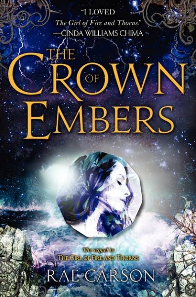
If you want to find out more about the book click on the cover.
And for those of you who haven't seen the cover for the first book or have forgotten what it looks like.
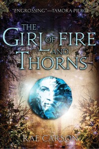
Reeshe Says: I think that both of the covers for The Girl of Fire and Thorns and The Crown of Embers are very beautiful and at a first glance The Crown of Embers does seems kind of cluttered but then when I continue to look at it, I start to notice the details in the cover and I understand everything that is going on and soon realize that the cover isn't cluttered at all. When I really look at both books I can feel the power each one has to draw people in with a single glance, and I think the person who designed the covers knew and understood the tone that would represent both books best. I think that these book covers are inspiring enough on their own, even without the story.
Sandy Says: I always like to see a sense of uniformity amongst covers in a series and when I say that I mean I like my covers to look like they are part of a set, not look exactly the same. More Seven Realms and less Evernight which I think is what has been achieved here with The Crown of Embers, the layout and font are obviously the same but the images, colours and textures are different. It's more sea and sky while The Girl of Fire and Thorns is more Earth. I love the colours and contrast of the second but I think they went a little overboard with textures, making it look a bit messy.


0 comments:
Post a Comment